AttackerKB
UX/UI & Branding
A Rapid7 Project



INTRO
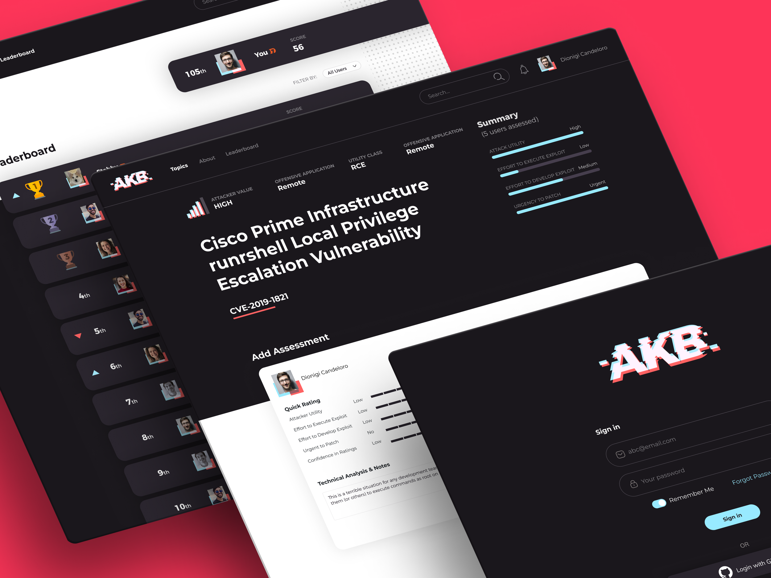
Launched by Rapid7 in 2020, AttackerKB is a web portal that crowdsources exploit assessments from Cyber Security professionals.
AKB’s goal is to provide a robust resource for the security community, and to highlight diverse perspectives on which vulnerabilities make the most appealing targets for hackers.
I worked alongside the Metasploit Engineering team at Rapid7 as the sole designer to build out the UI, UX, and branding of the AttackerKB platform.
02
GOAL
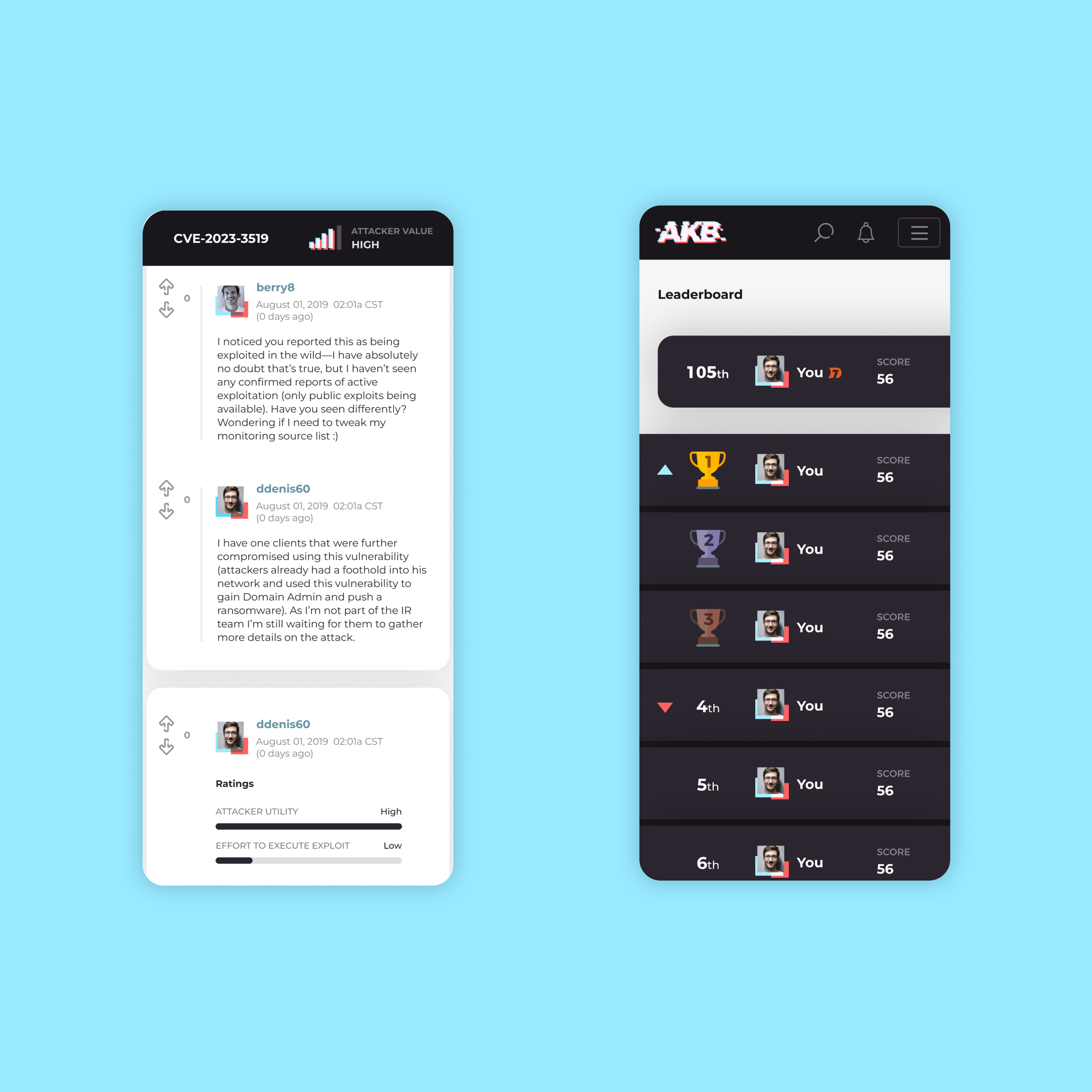
We wanted to create a forum reminiscent of Reddit, with upvote, download and discussion capabilities.
This enabled users to share their individual evaluations of exploits and take part in in-depth discussions on various topics.

03
TOPIC PAGE
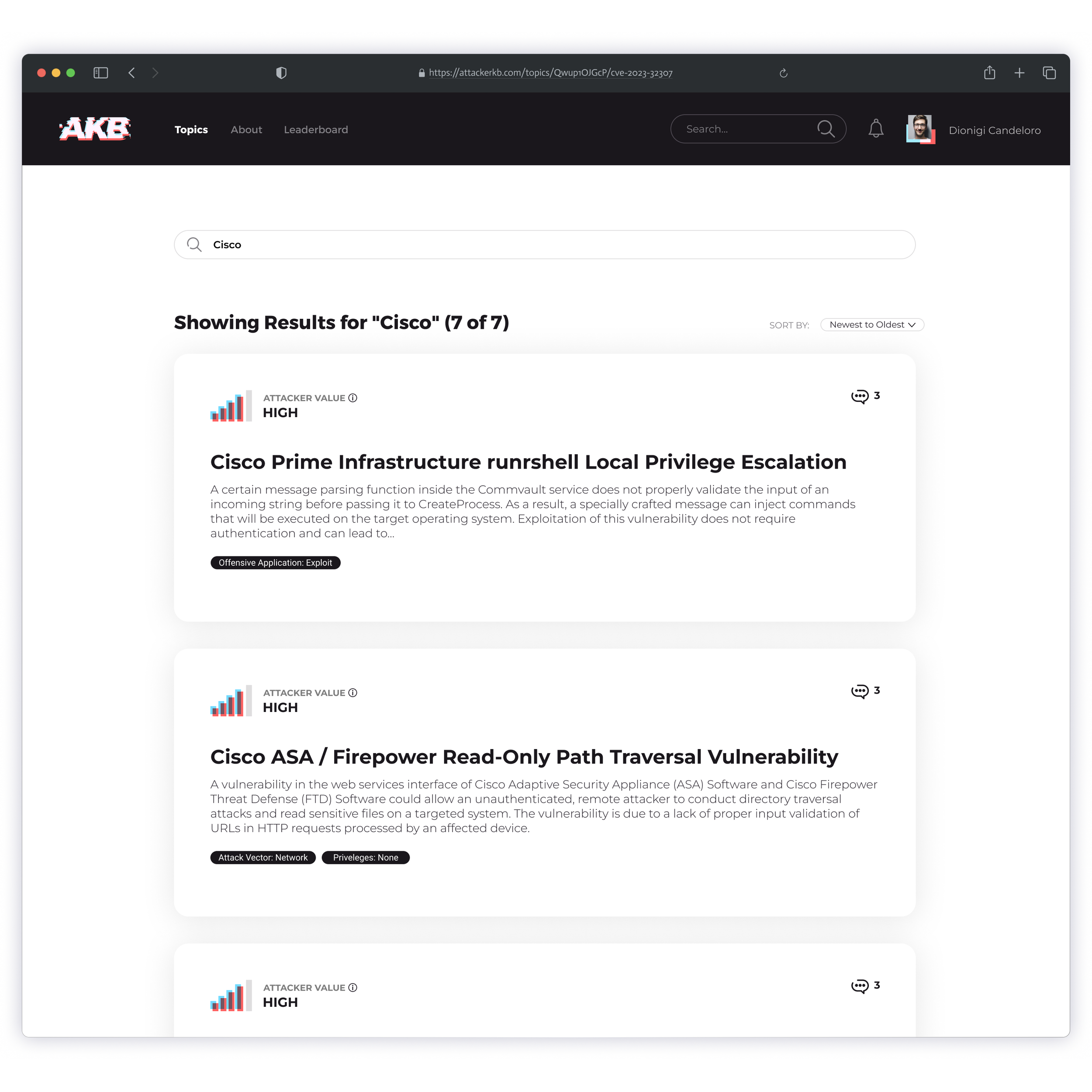
Each topic page featured a description, technical details and an aggregate summary of its exploit value.
The exploit summary was generated by the average of the user ratings.

04
RATINGS
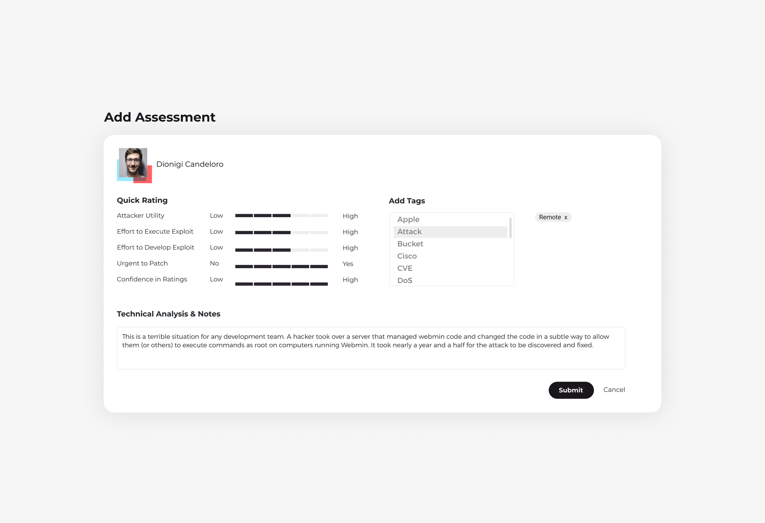
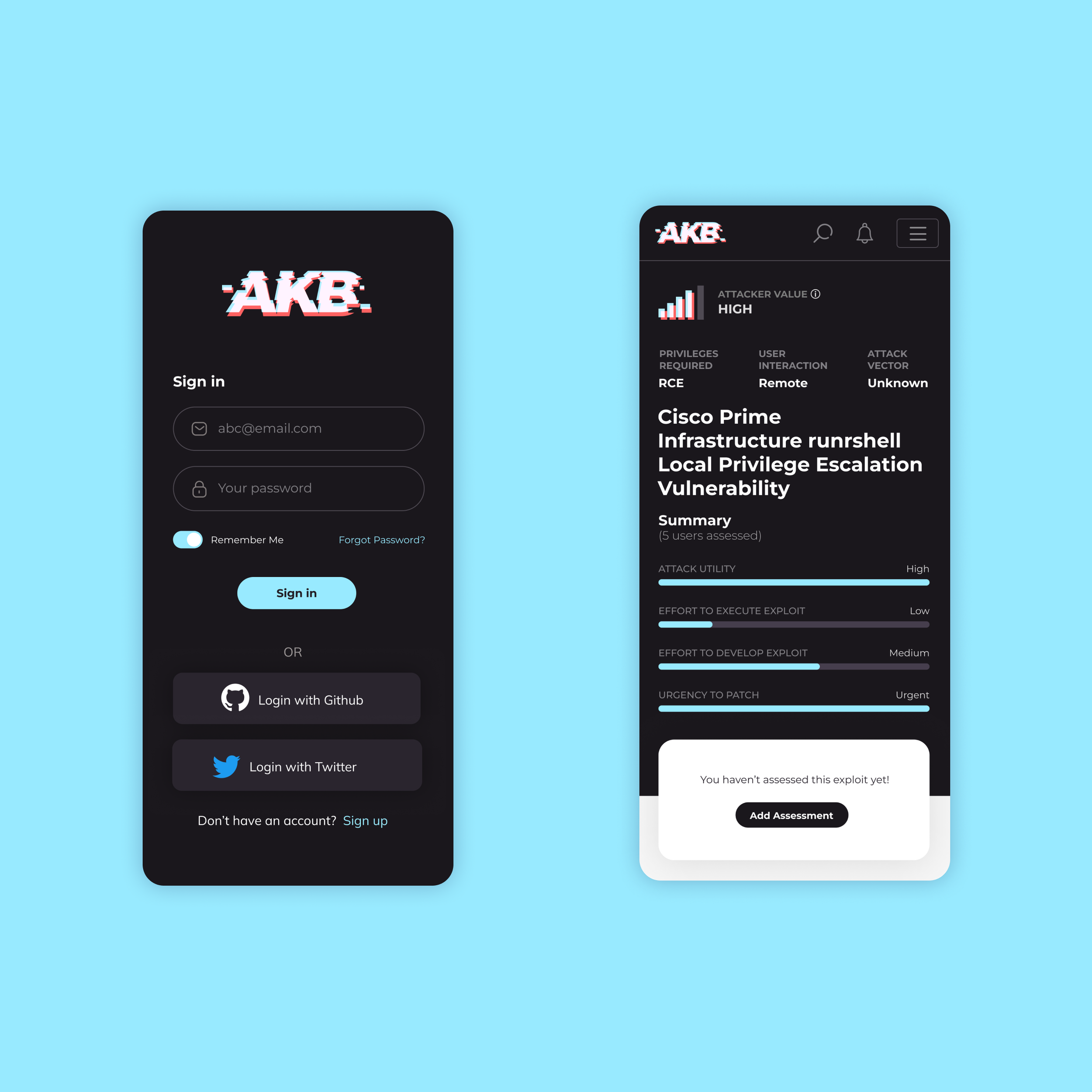
Users had the ability to rank exploits according to their severity level, allowing for detailed prioritization.
When submitting an assessment, users were prompted to include pertinent tags, express their own insights, and rate the assessment based on different criteria such as its usefulness to an attacker and the complexity of executing the exploit.
05
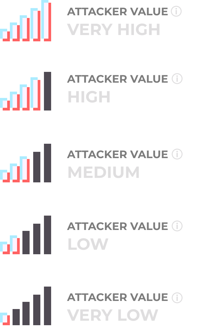
ATTACKER VALUE
The aggregate of the user’s ratings would display as an “Attacker Value” rating for each exploit.
Essentially, this rating gives the community an idea of how valuable this exploit is to a hacker who has malicious goals— like gaining access to valuable data, network, or computing resources.


06
Users have the ability to mark an exploit as exploited in the wild.
This feature allows users to notify the security community when they observe that this specific exploit has recently been utilized for malicious purposes— making it a top priority to patch.
07
GAMIFICATION
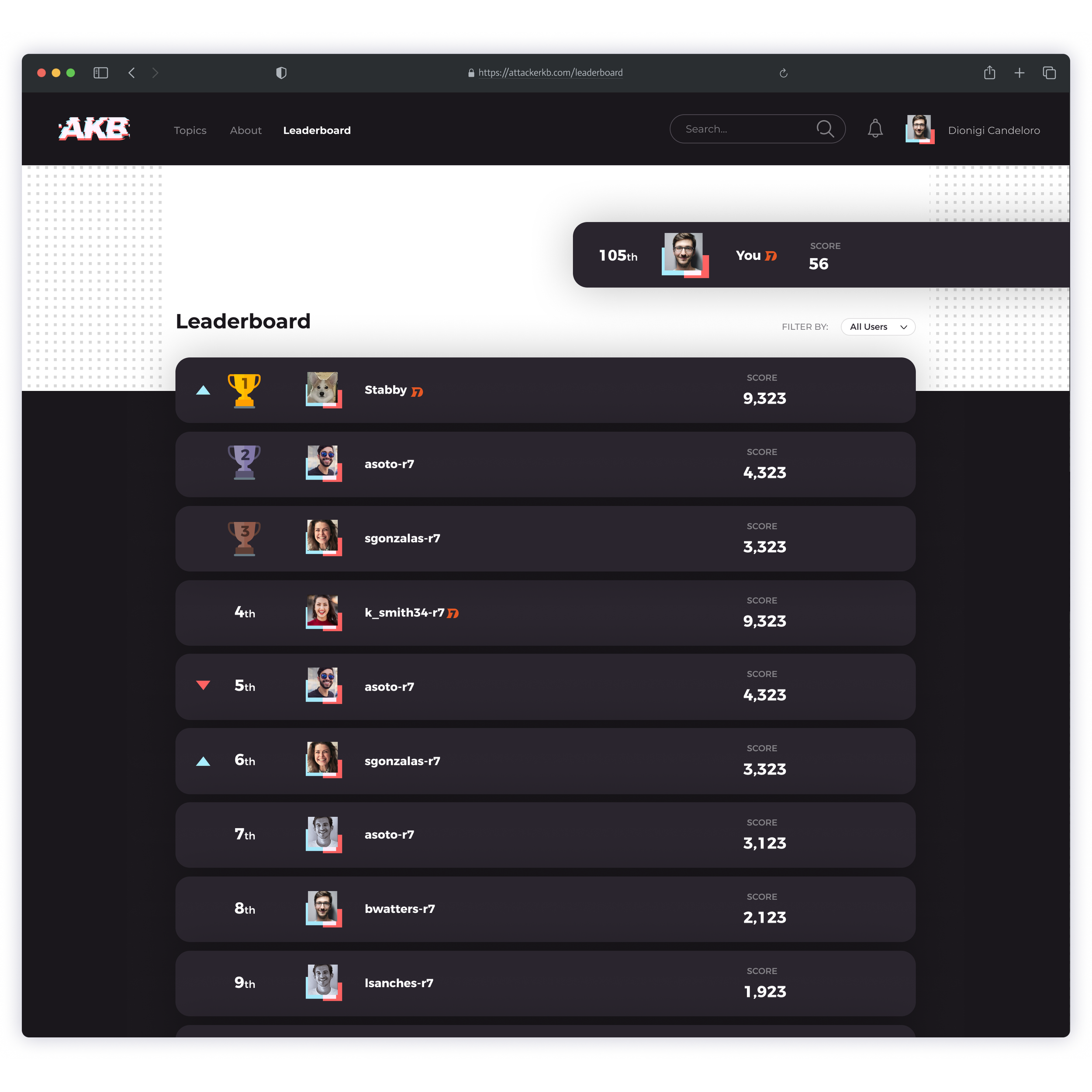
Shortly after the Alpha release, we decided to add a gamification element to the platform, in the form of a leaderboard and trophies/badges.
Users could now compete against each other to rise up the leaderboard and earn trophies that would then display on their profile, as well as next to all their assessments and posts.
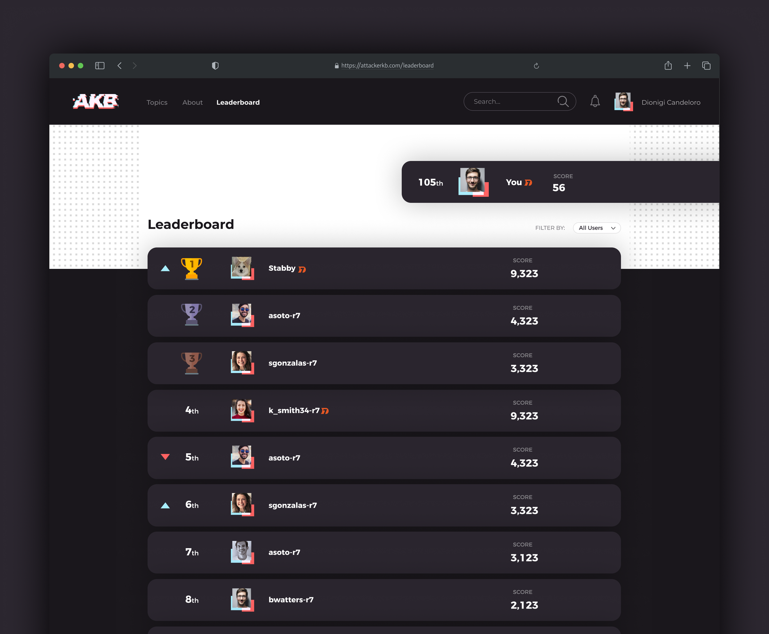


I illustrated a small set of trophies and badges to display across the site.

DESIGN SYSTEM
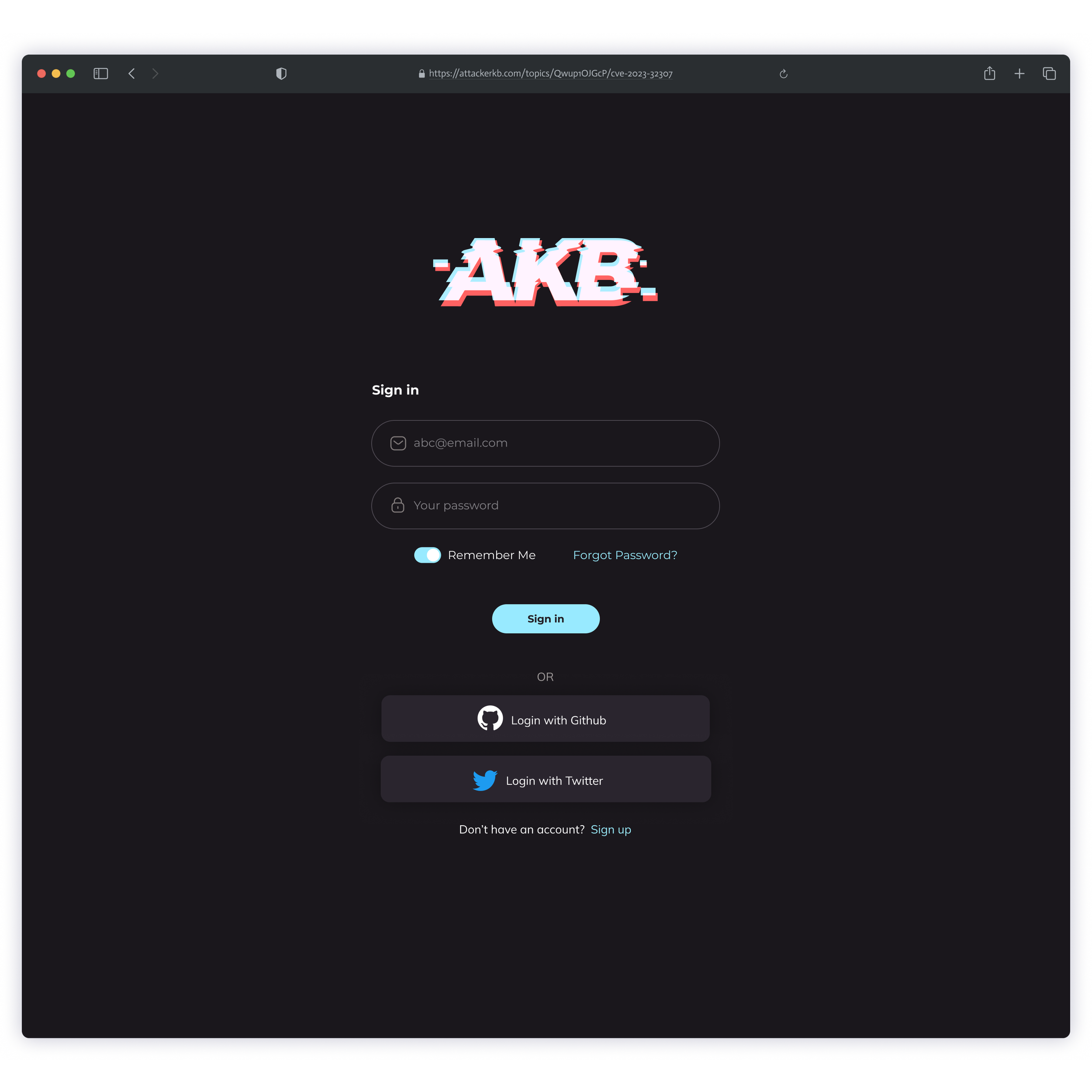
The Design System is a set of reusable UI components that match 1:1 with front-end code
As I designed the UI of AttackerKB, I made sure to categorize, organize, and build components in a scalable way— so in the future, if any other designer joined the team, it would be easier to create new pages and flows.



08
Before beginning exploration into the branding for AKB, I narrowed my goals down by deciding on some singular words that encompass the major themes of the project.
Vulnerability, Exploit, Hacking were used as general themes, my goal was to make sure all of the visuals for the branding and UI were tied closely to these ideas. They served as inspiration to create a cohesive brand.
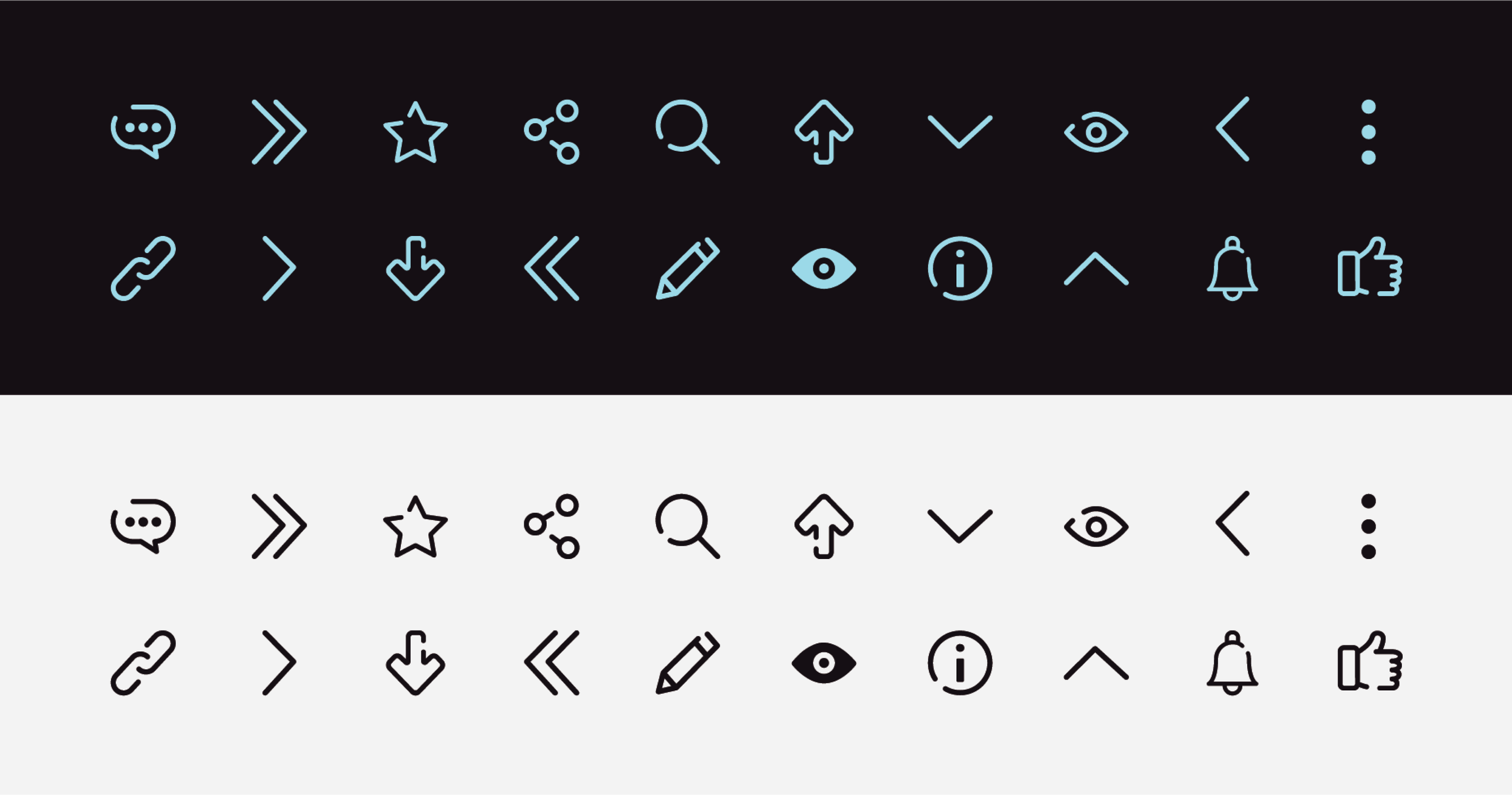
I used the idea of “Vulnerability” or “Exploit” as inspiration for other design elements, including iconography. All of the icons in the AttackerKB set are hollow and have openings in their line-work, this lends itself to the idea they are “open” or “exploitable” in some sense. All of the icons across the site follow this theme.
09





10
Keeping in mind the audience for AKB, I decided to keep the color scheme fairly simplistic. Users would be digesting large amounts of sometimes very technical information, which required a clean and simple UI. The pages are mostly white with nearly black ( Dark-Web #1A171C ) for body text.
Menace #FF6262 and Glitch #98EAFF were used together for the logo, Primary actions, and some infographic elements in the UI. Our team wanted the main branding colors to provoke a fun old-school stereotypical hacker vibe.


11